


Design
Principles.
Visual communication conveys meaning through visual language. Languages communicate meanings by applying principles of communication. English employs a grammatical structure known as syntax. Mathematics utilises numerical structure. Visual language employs various principles in creating two-dimensional compositions and three-dimensional forms. These principles of selection and arrangement of components, which are essential for a design to exist, are referred to as design principles. Through their application over time, these have evolved into design conventions.
Students may notice that different senior high school subjects use similar yet distinct lists of design principles. VCE Art CP, M&E, Visual Communication Design, and Product Design & Technology each have their own lists. This page refers to the Design Principles for VCE Visual Communication Design.
Takeaways

Good to go
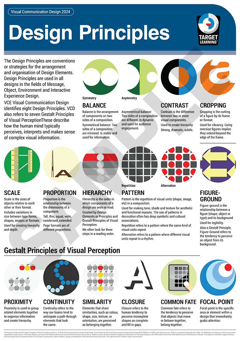
Design Principles
Design principles are conventions that guide the selection, arrangement, and composition of visual elements to communicate meaning in design effectively.
- Balance: The distribution of visual weight, either symmetrically for stability or asymmetrically for dynamic energy.
- Contrast: A visual difference between elements (e.g., colour, tone, shape) that creates emphasis and visual interest.
- Figure-ground: The relationship between an object (figure) and its background (ground), influencing legibility and focus.
- Cropping: Cutting or framing parts of an image to create emphasis or imply that content extends beyond the frame.
- Hierarchy: The visual order in which information is seen and read, often established through scale, colour, and positioning.
- Scale: The relative size of elements, used to suggest depth, importance, or attention.
- Proportion: The ratio of dimensions within elements or formats, influencing balance and visual harmony.
- Pattern: The repetition or alternation of visual components to create decoration, texture, or rhythm.


Jump to
Design principles
DESIGN Principles
Introduction
USING DESIGN ELEMENTS AND PRINCIPLES IN PRACTICAL EXERCISES
ON CHOOSING THE BEST DESIGN ELEMENTS AND PRINCIPLES FOR ANALYSIS QUESTIONS
In written tasks requiring the analysis of design elements and principles, students should be aware that they must choose only those elements and principles that clearly suit the examples. Time spent carefully selecting the best and most emphasised elements and principles is well spent. Students should then concentrate their discussions solely on the element or principle being analysed.
When discussing the role of design elements and principles, the correct usage of verbs is important. Students should note that an element is typically used to create an effect, while a principle often arises from the manipulation of an element. For example, different kinds of shapes (element) have been used to create contrast (principle).
Balance

Description
Balance in visual communication refers to the arrangement of components on two sides of a seen or implied vertical axis. There are two ways to balance a composition.
Symmetrical balance occurs when the two sides of the composition are the same, creating a mirror image of each other. Symmetrical balance results in a static, stable composition suited for informative or instructional visual communications.
On the other hand, asymmetrical balance consists of two sides of a balanced yet not mirrored composition. Components of different sizes are assigned varying degrees of visual weight to achieve this off-centre balance. Visual weight is affected by modifying one or more of the following: tones, colours, sizes, or distance/ proximity to the central axis. Visual communications that utilise asymmetrical balance create a more dynamic composition and are well-suited for purposes that encourage audiences to engage with the design.
Balance in communication design may also refer to elements positioned on either side of the horizontal axis. This includes a broader study of composition and encompasses grid layout, random layout, radial balance, spiral balance, and triangular composition.
Balance in industrial and environmental design relates to the physical equilibrium of structures.
IDENTIFY
Discuss
Model answer
Sample Question
Sample Answer
The icon for symmetrical balance (above) employs symmetrical balance. Each side of the composition is identical, featuring the same shapes and colours.
The icon for asymmetrical balance (also above) uses asymmetrical balance. The darker section on the left features a large white circle, while the right side contains a small white circle. The visual weights of both sides are balanced. The dark green possesses more visual weight but occupies less area. The small white circle has less visual weight, yet it is positioned further from the central axis, making it appear 'heavier'. This composition maintains asymmetrical balance.
Jump to
contrast
Description
Contrast refers to a difference between two or more components of a visual communication.
Varying any aesthetic qualities or components, including shape, colour, tone, texture, line, type, scale, or proportion, can create a contrast.
Contrast is used to create emphasis, a focal point, and visual tension in a design and can assist with building hierarchy. It is used in partnership with other design elements and/or principles.
IDENTIFY
Discuss
Contrast is referred to by adjectives like strong or subtle. Detail the extent of the contrast created, and then explain how it is achieved by referencing design elements, principles, or other aesthetic qualities.
The type of contrast in visual communication relates to its purpose. The analysis clarifies how the identified and explained contrast contributes to the communication of ideas in that context.
Model answer
Sample Question
Sample Answer
Jump to
Figure-ground
Description
Figure-ground refers to the relationship between a figure (shape, object, type) and its background. Although it shares most characteristics of the concepts' positive and negative shape' or 'form and counter form', figure-ground in visual communication emphasises the role of the ground beyond simply being a void in a composition.
Figure-ground is instrumental in providing legibility in visual communication. However, designers may choose to emphasise figures by creating strong contrasts in colour, texture, etc., or to hide them in opposite ways. The strength of the figure-ground used is related to the purpose of visual communication. Logos often employ a strong ground relationship.
IDENTIFY
Discuss
The strength of the figure-ground relationship. State clearly if it is a strong (contrasting)or weak (subtle or camouflaged) relationship.
Describe the extent to which the figure-ground relationship contributes to the hierarchy of the purpose of the visual communication.
Model answer
Sample Question
Sample Answer
Jump to
Cropping
Description
IDENTIFY
Discuss
Model answer
Sample Question
Sample Answer
Jump to
Hierarchy
Description
IDENTIFY
Discuss
Model answer
Sample Question
Sample Answer
Jump to
Scale
Description
IDENTIFY
The relative sizes of component parts are. Say which parts are the biggest and smallest.
Relate this understanding to the discussion of hierarchy, depth and/or balance.
Discuss
Describe the effect of having components of different sizes. One may also choose to discuss the scale of a component relative to the size of the format itself.
When designers are asked to apply one design to a variety of formats (poster, ticket, website, banner) they often have to change the scale of the components.
Model answer
Sample Question
Sample Answer
Jump to
Proportion
Description
Proportion refers to the ratio of the dimensions of a component. Two components may be similar in shape, however, the length and height of each are different. They are said to be of different proportions. One needs to be careful not to confuse proportion with scale. Proportion is not overall size, it refers to the ratio of height, width and/ or depth to each other.
Different (presentation) formats also have different proportions. They have different heights and widths. Some easy-to-relate-to formats are;
- Landscape
- Portrait
- Square
- Widescreen (16x9)
- TV (4x3)
A similar design must be adjusted to suit the above formats, as they have different proportions.
Proportion can also refer to how much of a kind of content. Think about the proportion of image to text on this page compared with the proportions of image to text on my artwork page. Very different.
IDENTIFY
The relative height, width, length, and depth of two or more components of a visual communication.
Identify the format used in a visual communication. Compare it with others if required.
Discuss
Proportions of components referring to their heights, widths, etc. relative to each other. You may use adjectives such as tall, thin, squat, wide, condensed or extended.
How the size and quantity of the components of a visual communication have been modified to suit formats of different proportions.
The proportion of types of content to each other. This may relate to the discussion of balance and hierarchy.
Model answer
Sample Question
Sample Answer
Jump to
Pattern

Description
The term " pattern " refers to the repetition of one or more visual units (shape, image, etc.). In our study, there are two kinds of patterns: repetition, where the same kind of visual unit repeats, and alternation, where different units repeat in a rhythm.
Pattern can create shade, texture, or decoration. Patterns usually have historical and cultural origins and are a fantastic means to embed intercultural understanding into designs. Pattern-making has been a meaningful and cathartic human endeavour for centuries.
IDENTIFY
If the pattern is repeated or alternating, the kinds of visual components that make up the pattern using design elements or principles.
The rhythm or density of the pattern units on the ground.
The historical, national and cultural heritage of the pattern if any.
Discuss
The purpose, use or function of a pattern.
The exact makeup of the pattern using design elements and/or principles.
The kind of rhythm the pattern is producing.
The overall aesthetic effect of the pattern.
Model answer
Sample Question
Sample Answer
Jump to
task

Show I know ...
1.1 Identify
1.2 Describe
(This is typically a difficult step, that students omit when they go directly to explain how...)
Describe the kinds of design principles. Are they used symmetrically or asymmetrically or do they appear strongly or weakly?