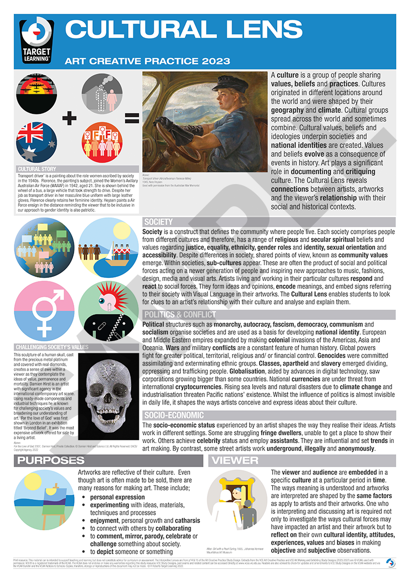
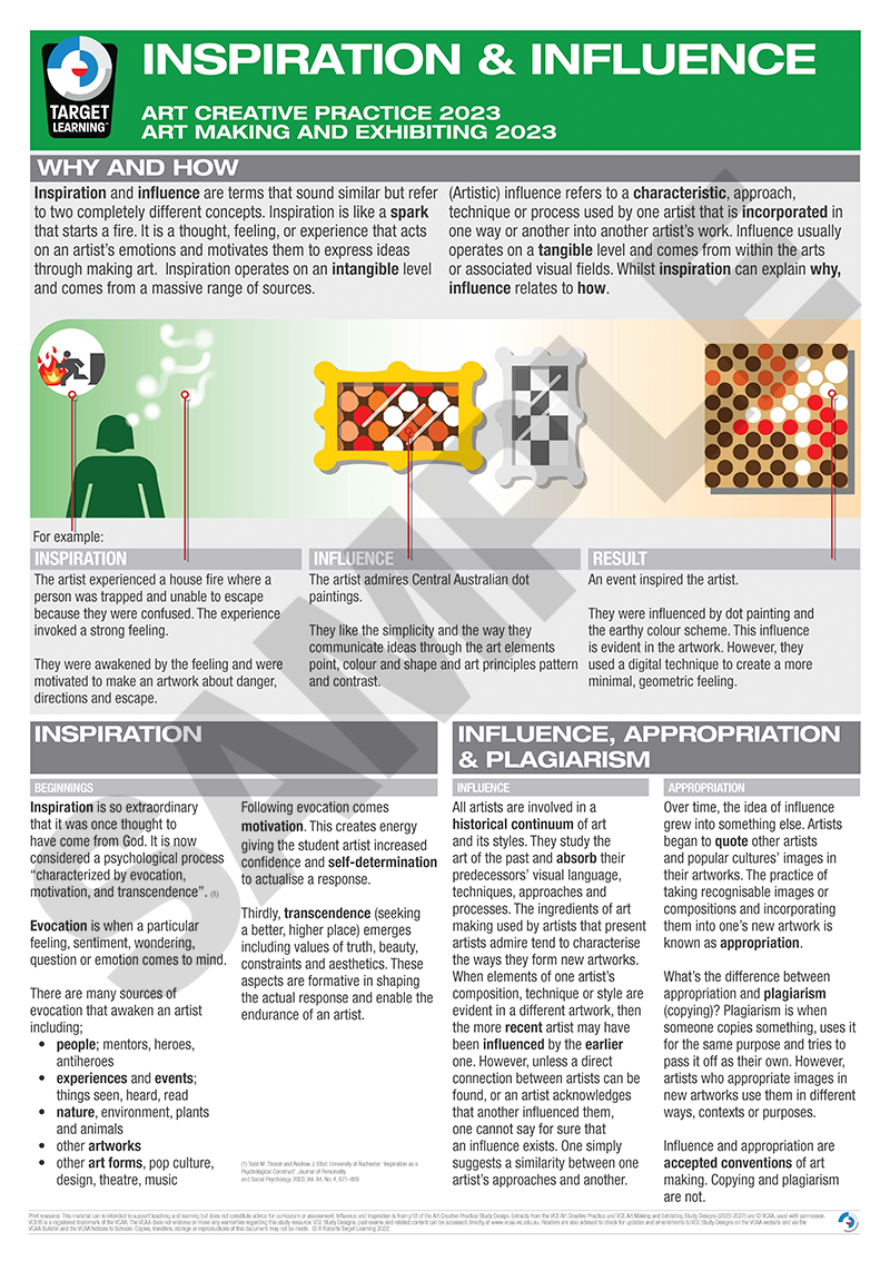
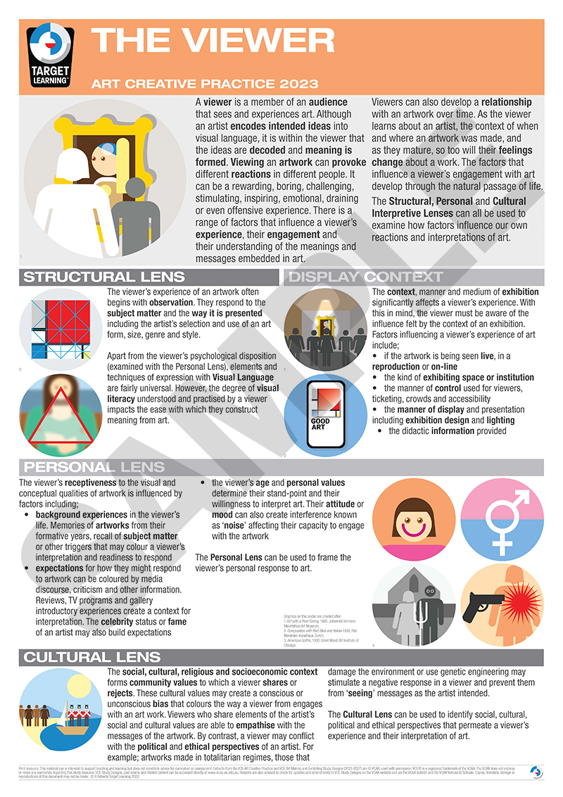
Art Creative Practice Poster pack
Price range: $352.00 through $518.40
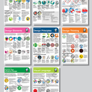
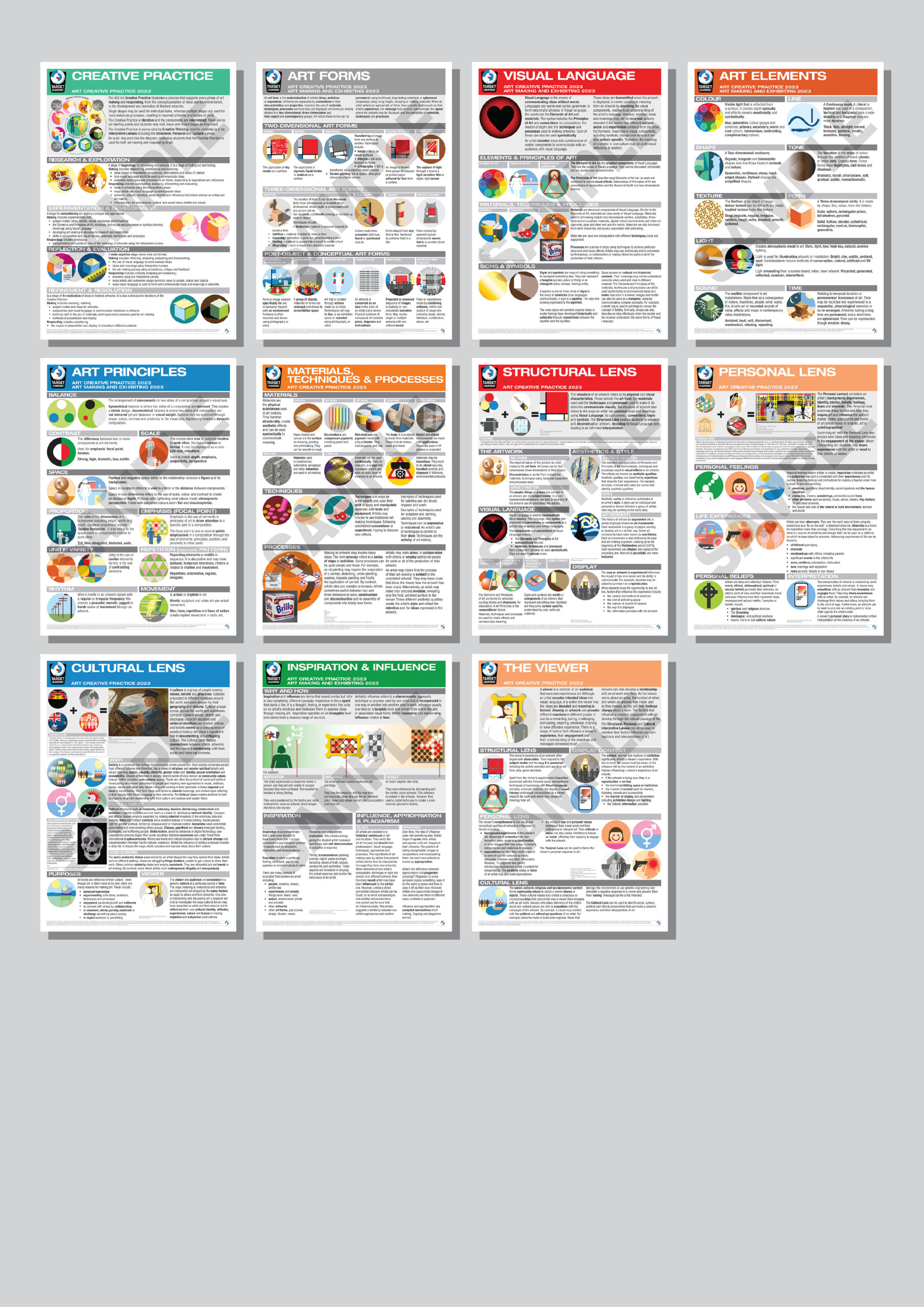
The Target Learning Art Creative Practice posters are a set of eleven visual aids to support your students learning in VCE Art Creative Practice (2023-27). This set includes the following posters;
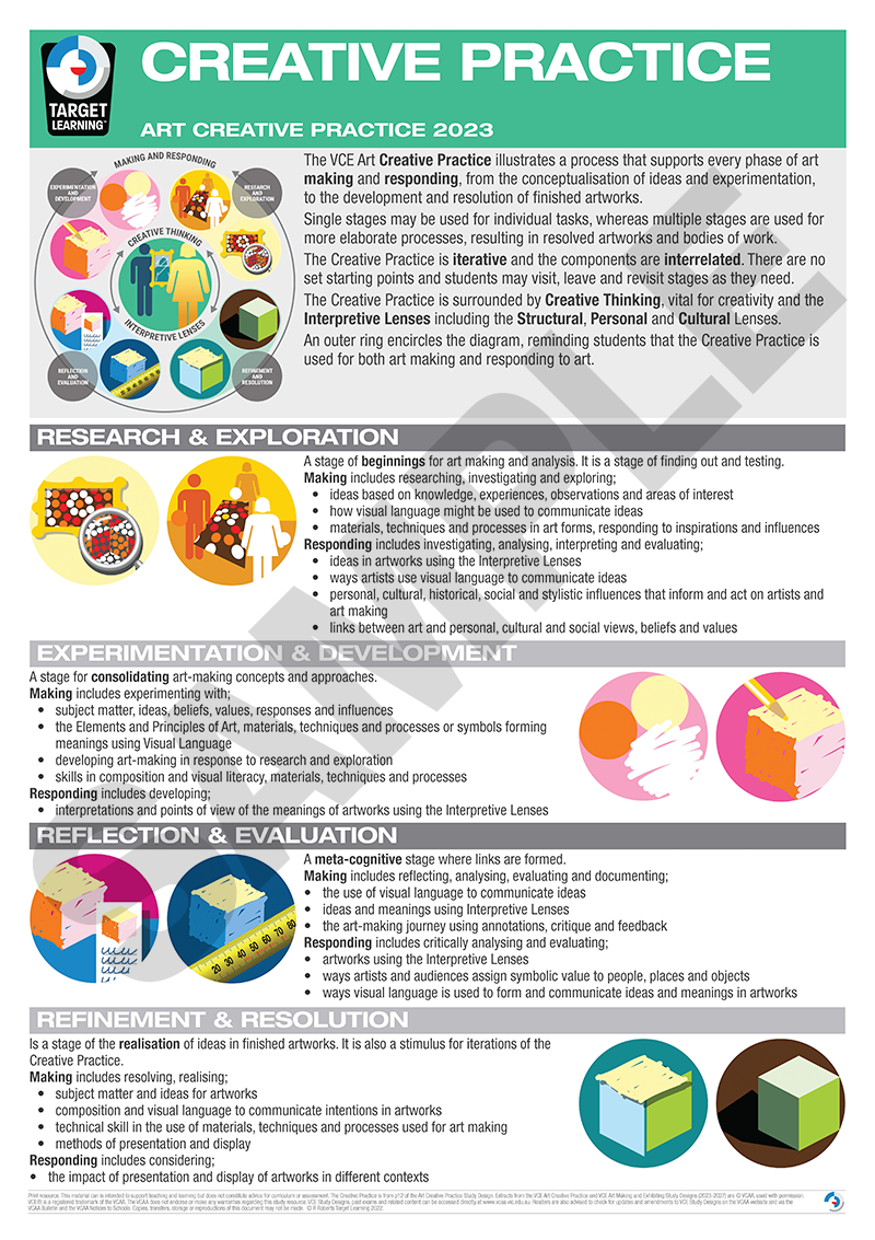
• The Creative Practice
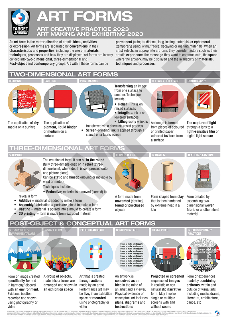
• Art forms
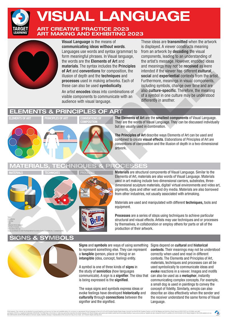
• Visual Language
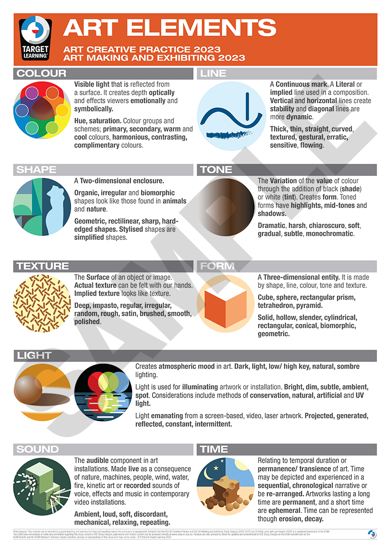
• Art Elements
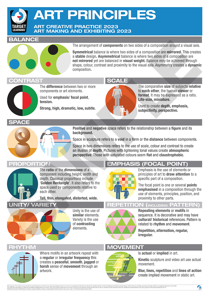
• Art Principles
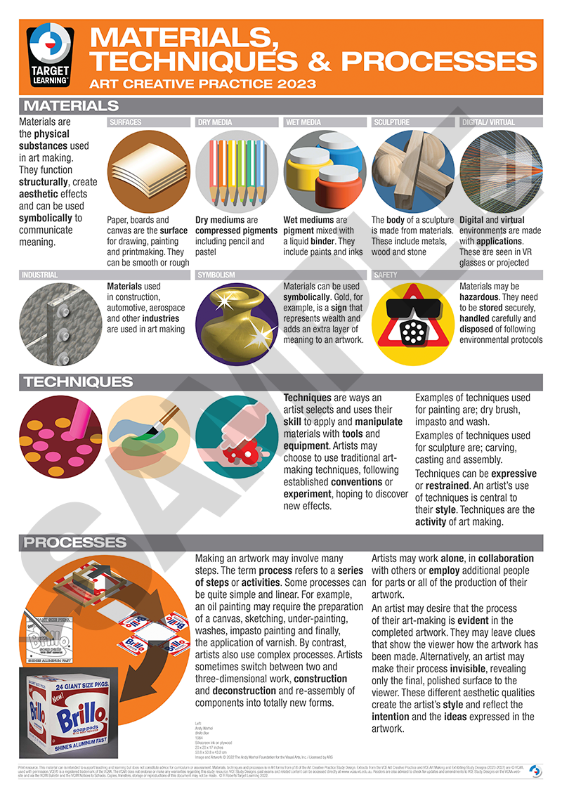
• Materials, Techniques and Processes
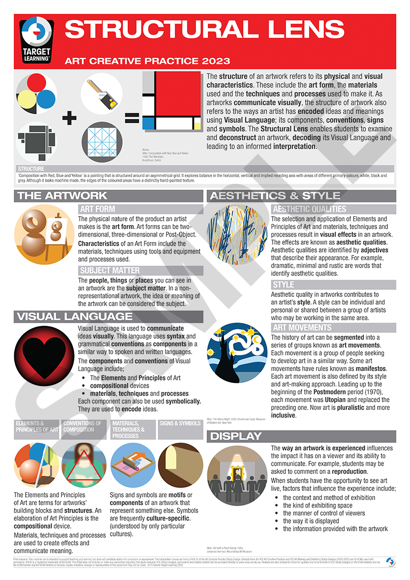
• Structural Lens
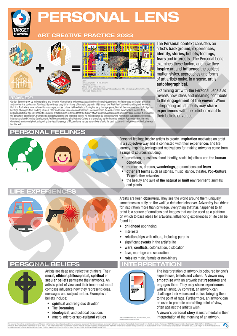
• Personal Lens
• Cultural Lens
• Inspiration and Influence
• The Viewer
Price $518.40 (This is a 20% discount on the normal $60/poster). Printed at A1 size (594 x 841 mm) on 160 gsm matte art poster paper. They come mailed to you in cardboard postage tubes. All posters in this series are also available separately on this page.
*Short on wall space? This pack is now available in A2 size for $352 for the same 11 posters in A2 size. This is a special order product so allow a bit more time.
For school purchase orders, please click here.
Additional information
| Size | A1, A2 |
|---|
Related products
-
Sale!

Art Making & Exhibiting Poster pack
Price range: $272.00 through $401.20 Select options This product has multiple variants. The options may be chosen on the product page -
Sale!
Visual Communication Design Poster Pack Trim
Price range: $272.00 through $401.20 Select options This product has multiple variants. The options may be chosen on the product page